Posts

Showing posts from November, 2021

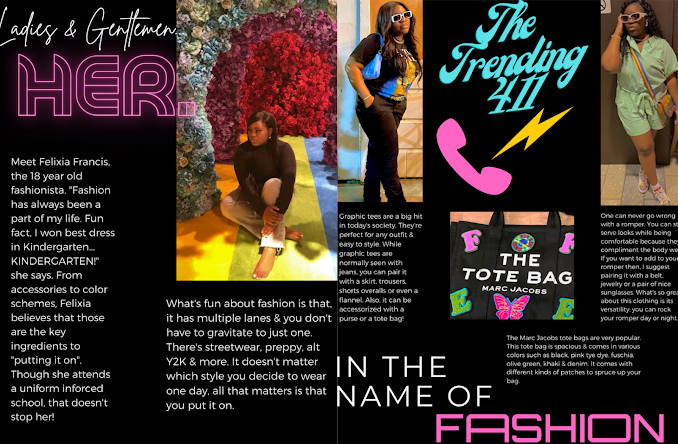
Blog Post #21: Magazine Reflecting!

Image
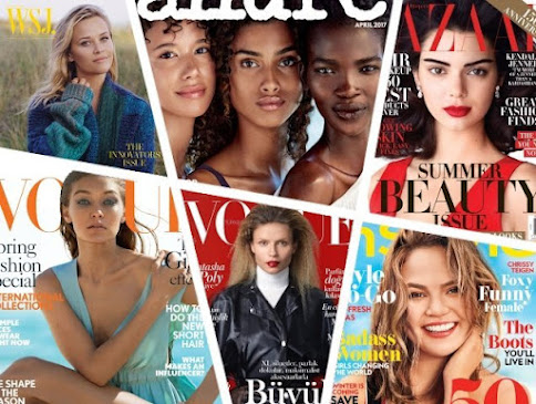
Hey everyone!  Today's blog is about me explaining how I'll incorporate information from what I've gathered & apply it to my magazine.  I'll use my knowledge in fashion to help further my magazine along with the research that I've gathered along this process (Ex: seasonal fashion tips etc.) Since "Girly Co." mirrors Essence, Vogue & Teen Vogue, I plan to use inspiration from their cover house style, demographic audience, aesthetics & more!  I'll incorporate Essence & Teen Vogue by mirroring its target audience & demographics which in result, will appeal to African American teenage girls. What I admire about Essence magazine is that, it shows how impactful black women can be in different fields of life. From fashion models, politicians, musicians, actresses- these ladies are proof that anything is possible.  Also, I like Teen Vogue because it's a magazine that appeals to the younger adult audience. Teens are still figuring out th

Blog Post #20: Finding Your Title

Image
Hello there, welcome back to my blog!  Today I'll be explaining the importance of finding the perfect masthead title to compliment your magazine. When searching for the right mastheading, it's important to think about what it'll represent for your brand. I titled my fashion magazine 'Girly Co.' because it's light & upbeat. I wanted something that African American women can relate to. We're constantly sharing things with the male species & this represents a safe space for women to find fashion inspiration. Though the name is 'Girly Co.' this magazine is very inclusive & covers all aspects of female wear. For instance, as women there are days where one will choose to be girly & other days sporty. It's all about  embracing your black girl magic!

Blog Post #19: THE TOP THREE: Two-Page Feature Story

Image
 Hello & welcome back to part three! Today I'll be going over the two- page feature story of my top three magazines.                                                                   Essence is always shedding light upon African American women & in this two-page feature story, Megan Thee Stallion is seen in a prestige, elegant setting. She talks about protecting her space, new album & the importance of having balance in life. The Grammy winner speaks on how she became who she is today & having the confidence to truly be herself. Also, Megan is a soon to be graduate from Texas Southern University & accomplished it all whilst chasing her dreams. Overall, her story is amazing because she's showing that African American women don't have to necessarily gravitate to one category & they can do it all. Unfortunately, since the Cindy Crawford Vogue magazine was debuted in the 80's, I was unable to get a digital copy. However, I used the Vogue two- page fe

Blog Post #18: Table of Contents

Image
Hello there! Today's blog is about my top three magazines table of contents! I'll be analyzing the magazines & describing it in my own words. Though it was a challenge trying to find the original table of contents for the published magazines, I tried to connect the two the best way I could. 'Essence' Unfortunately,  I could not find the table of contents for the, Megan Thee Stallion August 2021 magazine issue. Therefore, I will be analyzing a random Essence magazine table of contents. At first look, the cover is very visually pleasing with a pink, black & white color scheme. Also, Canadian- actress Kylie Bunbury is shown photographed.  The page numbers are medium sized and bolded and the story titles are featured above them with a small description of the story. Overall, the table of contents is clear, concise & visually appealing. 'Vogue' Once again, I was unable to find the original table of content page for the Vogue 90's cover page. At first

Blog Post #17: My Top Three Magazines!

Image
Welcome back everyone! Today I'll be revealing the top three magazines that'll best reflect my original magazine. Also, I'm going to do an analysis of the designs, content, layout, demographics & production of the three magazines. 'ESSENCE' First up is 'Essence' & I picked this magazine because it sheds light upon African American women & their accomplishments. First published in 1970, 'Essence' is a lifestyle magazine that was demographically made for African American women. It covers everything about fashion, beauty, entertainment & culture! Over the years, it went from monthly publishing to six issues a year.  Rapper & entertainer Megan Pete, 'Megan Thee Stallion' is featured on this cover above. Take Megan for instance, she recently became a college graduate & all of this was achieved while chasing her dreams; that's what I admire about this magazine, it showcases successful African American women so that other

Blog Post #16: The History of Fashion Magazines.

Image
And we're back! Hey guys, today I'll be researching about the history of magazines. Whether it's a tattoo magazine, fashion magazine, rap magazine or even a cooking magazine, it'll always appeal to a specific audience. With that being said, I decided to base my magazine off of fashion magazines. Fashion has been around for centuries & has been innovative throughout history. In 1867, Harper's Bazaar became the first fashion magazine to debut & it included everything from casual to couture. This paved the way for other successful establishments such as 'Vogue', 'Essence', 'Elle' & many more. These magazines are important due to its contribution to the fashion industry. It keeps society up to date with the current trends that are occurring in the world & helps people to decide what style suits them best. What's so amazing about fashion is that, it never goes out of style because it's what you make it. 

Blog Post #15: Double Page Spread Explanation

Image
  And we're back! Thank you for tuning back into my blog.  Today, I'll be addressing any issues that I experienced while making my double page spread. Let me start off by saying that, this is by far one of my favorite creations. I enjoyed the process & the detailing that went into it. Now with that being said, I wanted to keep the same aesthetic that I had going. Another problem that I experienced was finding a font that complimented the double page spread. In conclusion, I'm proud about what I created & this journey helped me learn & understand what it feels like to be an editor. As mentioned in my "All About Me" blog post, my dream profession is to become a journalist & I can honestly say that, this has contributed to that dream. Thank you for coming on this journey with me, until next time.

Blog Post #14: Preliminary Task- Double Page Spread

Image
 Hey there! In this blog, I'll be showing you guys the final part in the preliminary tasks, the *drumroll please* double page spread. I enjoyed making this part of the magazine & I hope you enjoy the finishing look.  Thanks for tuning in!

Blog Post #13: Preliminary Task- Table of Contents Explanation

Image
 Hey, welcome back to my blog! Today I'll be explaining my table of contents from my previous post  ↓ For the table of contents page, I piggybacked off the color scheme from my cover page. Next step was trying to find a font that would make the page stand out. I used the font "colo pro" because it's fun, cool & it reminds me of the 70's. After that, I wanted to use a graphic that was spunky & an abstract image was implemented however, I was more gravitated towards the zebra print. Also, I felt that the image of the garment measuring tape added to the aesthetic of the magazine page & in my opinion, it goes well with the theme.

Blog Post #12: 'Girly Co.' Table of Contents

Image
 PRELIMINARY TASK: TABLE OF CONTENTS FOR "GIRLY CO." Welcome back! Down below, you'll see my table of contents for "Girly Co." Since the topic is about all things fashion, I made sure to include that today. I also kept the pink color scheme. See you next time!

Blog Post #11: Preliminary Task: Cover Page Explanation

Image
 Hi, I'm glad that you're back! In this blog, I'll be going in depth about my previous blog. To start off, the title "Girly Co." is what I intend on naming my potential blog/magazine. So, I decided to implement it for the preliminary task. I obtained the hard hat image from the internet & the idea behind the pink hardhats is that, since this is a female owned magazine, I decided that this image would speak for "Girly Co." & what it stands for. Also, I went with the pink & neon yellow color scheme because, I like the color pink & the yellow was implemented to add an extra pop of color. Additional details:   ♡   Masthead ♡  Main Image ♡  Strapline ♡  Main Cover line ♡  Color Scheme ♡  Personalized House Style When creating this cover, I didn't have many issues other than the hard hat image appearing as pixel & finding the font that fits my magazine. The house style of this cover includes a color scheme of bright colors. I wanted it

Blog Post #10: Preliminary Task: Cover Page

Image
  Hey there!  In today's blog, I'm trying something new. Instead of analyzing someone else's magazine, I'll be creating my own for this preliminary task. The focus of this magazine is fashion trends, styling & tips. I'm proud of this cover because, it's my vision of what my magazine would look like. That's all for today's blog, thank you!

Blog Post #9: Analyzing House Style Reflection 2

Image
Welcome back to my blog! Today I'll be analyzing another magazine's house style. House Style: House style/ cover page: The model is Harry Styles & he is an English singer. The camera shot is a mid-shot & it captures the upper half of Harry's body. Also, the  color scheme is predominately black with a splash of white & blue. H arry is seen standing in front of the word 'VOGUE' in a dress which fights against social norms. He's seen blowing air into a balloon which leads me to believe that t his is meant to be an upbeat & bright photoshoot. Also, the target audience is said to be for teens & young adults (early- late 20's) due to Harry's fan base mostly being teenagers.     Table of contents: Unfortunately, I was unable to find the original table of contents from Harry's 'VOGUE' magazine. However, I used an old content from a 2015 issue. Here, it shows two women: one leaning against a bookcase & another sitting in a chai

Blog Post #8: Analyze House Style Reflection

Image
  MAGAZINE 1- WITHIN THE LAST 6 MONTHS Hello & welcome back to my blog! Today I will be analyzing a magazine cover, house style & feature story from a popular magazine. House Style:  The magazine cover above consists of a masthead, a main headline & coverlines  with a pink & rose gold color scheme to coordinate with the overall aesthetic of the cover. What's also included is the didot "VOGUE" font & classy mid shot of the model which ties the magazine all together.  Cover Page: The rose gold represents luxury, style & elegance. As you can see, the model is seen wearing rose gold & she's representing all of those things.